最近几年来,地理信息系统无论是在理论上还是应用上都处在一个飞速发展的阶段。 GIS被应用于多个领域的建模和决策支持,如城市管理、区划、环境整治等等,地理信息成为信息时代重要的组成部分之一; “数字地球”概念的提出,更进一步推动了作为其技术支撑的GIS的发展。 与此同时,一些学者致力于相关的理论研究,如空间感知、空间数据误差、空间关系的形式化等等。 这恰好说明了地理信息系统作为应用技术和学科的两个方面,并且这两个方面构成了相互促进的发展过程。
8.10.1. CSS3 conversion 
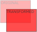
CSS3 transformations can move, scale, rotate, lengthen, or stretch elements.

8.10.2. How does it work? 
The effect of the transformation is to change the shape, size and position of an element.
You can use 2D or 3D transformations to transform your elements.
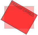
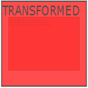
Move your mouse over the following elements to see the conversion effects of2D and 3D:
2D conversion
3D conversion
8.10.3. Browser support 
The number in the table represents the first browser version number that supports the property.
The number immediately before-webkit-,-ms- or-moz- is the first browser version number that supports the prefix attribute.
Attribute | |||||
|---|---|---|---|---|---|
Transform | 36 | 10 | 16 | 3.2-webkit- | 23 |
4.0-webkit- | 9.0-ms- | 3.5 -moz- | 15.0-webkit- | ||
12.1 | |||||
10.5-o- | |||||
Transform-origin | 36 | 10 | 16 | 3.2-webkit- | 23 |
(two-value syntax) | 4.0-webkit- | 9.0-ms- | 3.5 -moz- | 15.0-webkit- | |
12.1 | |||||
10.5-o- |
Internet Explorer 10, Firefox, and Opera support the transform attribute.
Chrome and Safari require a prefix-webkit- version.
Note: Internet Explorer 9 requires a prefix-ms- version.
8.10.4. 2D conversion 
In this chapter you will learn about 2D transformation methods:
translate()rotate()scale()skew()matrix()
You will learn about 3D conversion in the next chapter.
Example
div { transform: rotate(30deg); -ms-transform: rotate(30deg); /* IE 9 */ -webkit-transform: rotate(30deg); /* Safari and Chrome */ } 8.10.5. translate() method 
translate() method to move from the current element position based on the parameters given by the left (X axis) and top (Y axis) positions.
Example
div { transform: translate(50px,100px); -ms-transform: translate(50px,100px); /* IE 9 */ -webkit-transform: translate(50px,100px); /* Safari and Chrome */ } translate the value (50pxmeary 100px) moves 50 pixels from the left element and 100 pixels from the top.
8.10.6. rotate() method 
rotate() method, an element that rotates clockwise in a given degree. Negative values are allowed so that the element rotates counterclockwise.
Example
div { transform: rotate(30deg); -ms-transform: rotate(30deg); /* IE 9 */ -webkit-transform: rotate(30deg); /* Safari and Chrome */ } rotate value (30deg) element rotates 30 degrees clockwise.
8.10.7. Scale () method 
scale() method, the size that the element increases or decreases dependson the parameters of the width (X axis) and height (Y axis):
Example
-ms-transform:scale(2,3); /* IE 9 */ -webkit-transform: scale(2,3); /* Safari */ transform: scale(2,3); /* Standard Grammar */ Scale (2) the transition width is 2 times its original size and its height is 3 times its original size.
8.10.8. skew() method 
Grammar 
transform:skew(<angle> [,<angle>]); Contains two parameter values that represent the angle of tilt on the X and Y axes, respectively. If the second parameter is empty, the default is 0, and a negative parameter indicates a tilt in the opposite direction.
skewX(); indicates that it is tilted only in the X axis (horizontal direction). skewY(); indicates that it is tilted only in the Y axis (verticaldirection). Example
div { transform: skew(30deg,20deg); -ms-transform: skew(30deg,20deg); /* IE 9 */ -webkit-transform: skew(30deg,20deg); /* Safari and Chrome */ }
skew(30deg,20deg)the element tilts 20 degrees and 30 degrees on the X and Y axes.8.10.9.
matrix()method ¶matrix()method and 2D transformation method are merged into one.matrixthe method has six parameters, including rotation, scaling, moving (translation), and tilting functions.Example
Utilization
matrix()method rotate the div element 30 °div { transform:matrix(0.866,0.5,-0.5,0.866,0,0); -ms-transform:matrix(0.866,0.5,-0.5,0.866,0,0); /* IE 9 */ -webkit-transform:matrix(0.866,0.5,-0.5,0.866,0,0); /* Safari and Chrome */ }
8.10.10. New conversion attribute 
All the transformation attributes are listed below:
Property
Description
CSS
Transform
Elements suitable for 2D or 3D conversion
3
Transform-origin
Allows you to change the location of the converted element
3
2D conversion method 
Function
Description
Matrix (npendium, npendium, pyrrine, n)
Define a 2D transformation, using a matrix of six values.
Translate (XBI y)
Define a 2D transformation to move elements along the X and Y axes.
TranslateX (n)
Define a 2D transformation to move elements along the X axis.
TranslateY (n)
Define a 2D transformation to move the element along the Y axis.
Scale (XBI y)
Define a 2D scaling transformation to change the width and height of the element.
ScaleX (n)
Define a 2D scaling transformation to change the width of the element.
ScaleY (n)
Define a 2D scaling transformation to change the height of the element.
Rotate (angle)
Define 2D rotation and specify the angle in the parameters.
Skew (xripangle.ymurangle)
Defines a 2D tilt transformation along the X and Y axes.
SkewX (angle)
Define a 2D tilt transformation along the X axis.
SkewY (angle)
Defines a 2D tilt transformation along the Y axis.
- 1. Angularjs2 8
- 1. SVG tutorial 19
- 1. Memcached 20
- 1. C# tutorial 61
- 1. Sqlite 47
- 2. Go 43
- 2. Docker 59
- 2. Vue3 19
- 2. Servlet 21
- 3. React 23
- 3. SOAP tutorial 10
- 3. Android 18
- 3. Mongodb 44
- 3. Kotlin 18
- 4. Lua 31
- 4. MySQL tutorial 35
- 4. Appml 12
- 5. Perl 45
- 5. Postgresql 41
- web 15
- 5. Web Services tutorial 6
- 6. Ruby 42
- 6. Design-pattern 35
- 7. Django 18
- 7. Rust 22
- 6. WSDL tutorial 8
- 8. Foundation 39
- 9. Ios 43
- 8. Css3 26
- 8.20. CSS3 Elastic Box (Flex Box)
- 8.9. CSS3 font
- 8.13. CSS3 animation
- 8.6. CSS3 background
- 8.26. CSS grid element
- 8.25. CSS Grid Container
- 8.15. CSS3 user interface
- 8.17. CSS button
- 8.1. CSS3 tutorial
- 8.7. CSS3 gradient
- 9. Swift 44
- 11. HTML tutorial-(HTML5 Standard) 54
- 12. Http 6
- 13. Regex 6
- 14. Regexp 8
- 1. Introduction to geographic information system 6
- 2. From the Real World to the Bit World 3
- 3. Spatial Data Model 7
- 4. 空间参照系统和 地图投影 5
- 5. Data in GIS 3
- 6. Spatial data acquisition 2
- 7. Spatial Data Management 6
- 8. Spatial analysis 8
- 9. 数字地形模型( DTM )与地形分析 5
- 10. 空间建模与 空间决策支持 6
- 11. Spatial data representation and map making 6
- 12. 3S Integration Technology 5
- 13. 网络地理信息系统 3
- 14. Examples of Geographic Information System Application 8
- 15. Organization and Management of Geographic Information System Application Projects 9
- 16. Geographic Information system Software Engineering Technology 6
- 17. Geographic Information System Standards 3
- 18. Geographic Information System and Society 3
- 19. Earth Information Science and Digital Earth 3