最近几年来,地理信息系统无论是在理论上还是应用上都处在一个飞速发展的阶段。 GIS被应用于多个领域的建模和决策支持,如城市管理、区划、环境整治等等,地理信息成为信息时代重要的组成部分之一; “数字地球”概念的提出,更进一步推动了作为其技术支撑的GIS的发展。 与此同时,一些学者致力于相关的理论研究,如空间感知、空间数据误差、空间关系的形式化等等。 这恰好说明了地理信息系统作为应用技术和学科的两个方面,并且这两个方面构成了相互促进的发展过程。
To make Grid elements consisting of columns and rows are placed in the grid container. Property values are a list separated by spaces, where each value defines thewidth relative to the column. If you want the grid layout to contain 4 columns, you need to set the width of 4 columns. If all columns are the same width, you can set the width to The following example sets a grid layout with 4 columns: Example Note: if you have more than 4 grid elements in a 4-column grid, the grid layout generates a new row to place the element. Example Property values are a list separated by spaces, where each value defines theheight relative to the row: Example Note: the total width of the grid must be less than the width of the container to make Example Example Example Example Example Example Note: the total height of the grid element must be less than the height of the container to make Example Example Example Example Example Example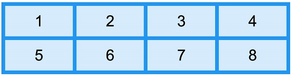
8.25.1. Grid container 
HTML element into a grid container, you can set the display property is set to grid or inline-grid . grid-template-columns attribute ¶ grid-template-columns property defines the number of columns in the gridlayout, and it can also set the width of each column. auto ..grid-container { display: grid; grid-template-columns: auto auto auto auto; }
grid-template-columns property can also be used to specify the width of the column..grid-container { display: grid; grid-template-columns: 80px 200px auto 40px; }
grid-template-rows attribute ¶ grid-template-rows property to set the height of each row..grid-container { display: grid; grid-template-rows: 80px 200px; }
justify-content attribute ¶ justify-content property is used to align the grid within the container and set how to allocate space between and around elements along the principal axis (or grid row axis) of the elastic container. justify-content property takes effect. justify-content for more information, please refer to: CSS justify-content attribute.grid-container { display: grid; justify-content: space-evenly; }
.grid-container { display: grid; justify-content: space-around; }
.grid-container { display: grid; justify-content: space-between; }
.grid-container { display: grid; justify-content: center; }
.grid-container { display: grid; justify-content: start; }
.grid-container { display: grid; justify-content: end; }
align-content attribute ¶ align-content property is used to set the alignment of vertically oriented grid elements in the container. align-content property takes effect..grid-container { display: grid; height: 400px; align-content: center; }
.grid-container { display: grid; height: 400px; align-content: space-evenly; }
.grid-container { display: grid; height: 400px; align-content: space-around; }
.grid-container { display: grid; height: 400px; align-content: space-between; }
.grid-container { display: grid; height: 400px; align-content: start; }
.grid-container { display: grid; height: 400px; align-content: end; }