最近几年来,地理信息系统无论是在理论上还是应用上都处在一个飞速发展的阶段。 GIS被应用于多个领域的建模和决策支持,如城市管理、区划、环境整治等等,地理信息成为信息时代重要的组成部分之一; “数字地球”概念的提出,更进一步推动了作为其技术支撑的GIS的发展。 与此同时,一些学者致力于相关的理论研究,如空间感知、空间数据误差、空间关系的形式化等等。 这恰好说明了地理信息系统作为应用技术和学科的两个方面,并且这两个方面构成了相互促进的发展过程。
We can install Bootstrap5 in two ways:
Use Bootstrap5 CDN.
From the official website getbootstrap.com download Bootstrap 5.
Libraries on Staticfile CDN are recommended in China: Bootstrap5 CDN Note: Bootstrap5 CDN In addition, you can use the following CDN services: Domestic recommended use: https://www.staticfile.org/ Internationally recommended: https://cdnjs.com/ You can download the Bootstrap5 repository from the official website https://getbootstrap.com/ . Note: in addition, you can also install it through the package management tools npm, yarn, gem, composer, etc. Bootstrap requires the use of the HTML5 file type, so you need to add a HTML5 doctype declaration. HTML5 doctype declares in the document header and sets the corresponding encoding: To make the website developed by Bootstrap friendly to mobile devices and ensure proper rendering and touchscreen scaling, you need to add a viewport meta tag to the head of the web page, as shown below: Bootstrap 5 requires a container element to wrap the content of the site. We can use the following two container classes: Bootstrap5 The following example shows a container that occupies all viewports (viewport). Bootstrap5 
7.2.1. Bootstrap 5 CDN 
popper.min.js used to set pop-up windows, prompts, and drop-down menus. bootstrap.bundle.js (uncompressed version) or bootstrap.bundle.min.js (compressed version) contains bundled plug-ins such as popper.min.js and other dependent scripts, so we can also use the following code directly:
7.2.2. Download Bootstrap 5 
npm install bootstrap
yarn add bootstrap
gem install bootstrap -v 5.1.1
composer require twbs/bootstrap:5.1.1
Create the first Bootstrap 5 page 
7.2.3. 1.Add HTML5 doctype 
7.2.4. Mobile device priority 
<meta name="viewport" content="width=device-width, initial-scale=1">
width=device-width Indicates that the width is the width of the device screen. initial-scale=1 Represents the initial scale.Container class 
.container class is used for containers that are fixed in width and support a responsive layout. .container-fluid class is used for containers that are 100% wide and occupy all viewports (viewport).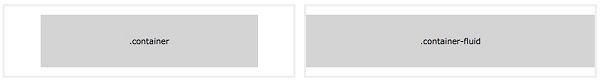
Two Bootstrap 5 pages 
.container example<div class="container"> <h1>My first Bootstrap pageh1> <p>These are some texts.p> div>
.container-fluid example <div class="container-fluid"> <h1>My first Bootstrap pageh1> <p>Used. container fluid, 100% width, occupying all viewport containers.p> div>