最近几年来,地理信息系统无论是在理论上还是应用上都处在一个飞速发展的阶段。 GIS被应用于多个领域的建模和决策支持,如城市管理、区划、环境整治等等,地理信息成为信息时代重要的组成部分之一; “数字地球”概念的提出,更进一步推动了作为其技术支撑的GIS的发展。 与此同时,一些学者致力于相关的理论研究,如空间感知、空间数据误差、空间关系的形式化等等。 这恰好说明了地理信息系统作为应用技术和学科的两个方面,并且这两个方面构成了相互促进的发展过程。
In this chapter, we will learn how to create a form using Bootstrap. Bootstrap can create different styles of forms with some simple HTML tags and extended classes.
Form elements, textarea, and select elements are used in the case of the Stacked forms (full screen width): vertical Inline forms: horizontal Bootstrap provides two types of form layouts: The following example uses two input boxes, a check box, and a submit buttonto create a stacked form: Display effect: In the example, we use The check box (checkboxe) uses a different tag. They use the If you want form elements to be displayed side by side, use the The two input boxes of the following example are displayed side by side to create an inline form: Display effect: Use Display effect: We can pass through the Display effect: Use Use Use Display effect: .form-control class, the width is set to 100%. 7.31.1. Bootstrap5 form layout 
Stack form 
7.31.2. Example 
<form> <div class="mb-3 mt-3"> <label for="email" class="form-label">Email:label> <input type="email" class="form-control" id="email" placeholder="Enter email" name="email"> div> <div class="mb-3"> <label for="pwd" class="form-label">Password:label> <input type="password" class="form-control" id="pwd" placeholder="Enter password" name="pswd"> div> <div class="form-check mb-3"> <label class="form-check-label"> <input class="form-check-input" type="checkbox" name="remember"> Remember me label> div> <button type="submit" class="btn btn-primary">Submitbutton> form>
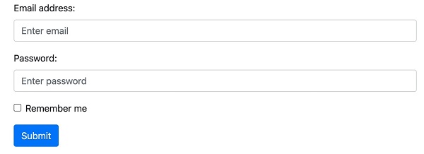
.form-label class to ensure that the tag element has a certain inner margin. .form-check wrap around the container elements. Check boxes and radio buttons use the .form-check-input whose label can be used .form-check-label class. Inline form 
.row and .col : 7.31.3. Example 
<form> <div class="row"> <div class="col"> <input type="text" class="form-control" placeholder="Enter email" name="email"> div> <div class="col"> <input type="password" class="form-control" placeholder="Enter password" name="pswd"> div> div> form>

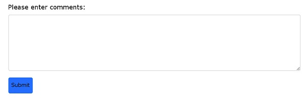
Text box 
textarea label to create a text box to submit the form, using the .form-control class render text box textareas label: 7.31.4. Example 
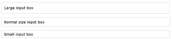
Input box size 
.form-control use in the input box .form-control-lg or .form-control-sm class to set the size of the input box 7.31.5. Example 
<input type="text" class="form-control form-control-lg" placeholder="Large input box"> <input type="text" class="form-control" placeholder="Normal size input box"> <input type="text" class="form-control form-control-sm" placeholder="Small input box">
Disable / read-only form 
disabled/readonly Property setting input box disabled / read-only: 7.31.6. Example 
<input type="text" class="form-control" placeholder="Normal input"> <input type="text" class="form-control" placeholder="Disabled input" disabled> <input type="text" class="form-control" placeholder="Readonly input" readonly>
Plain text input 
.form-control-plaintext Class can delete the border of the input box: 7.31.7. Example 
<input type="text" class="form-control-plaintext" placeholder="Plaintext input"> <input type="text" class="form-control" placeholder="Normal input">
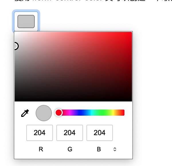
Color picker 
.form-control-color Class can create a color picker: 7.31.8. Example 
<input type="color" class="form-control form-control-color" value="#CCCCCC">